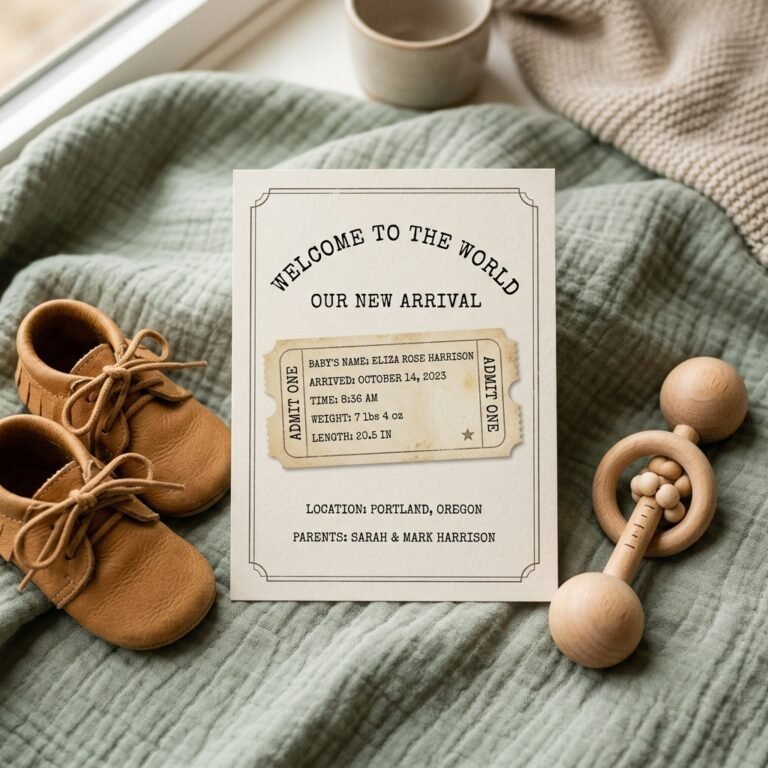
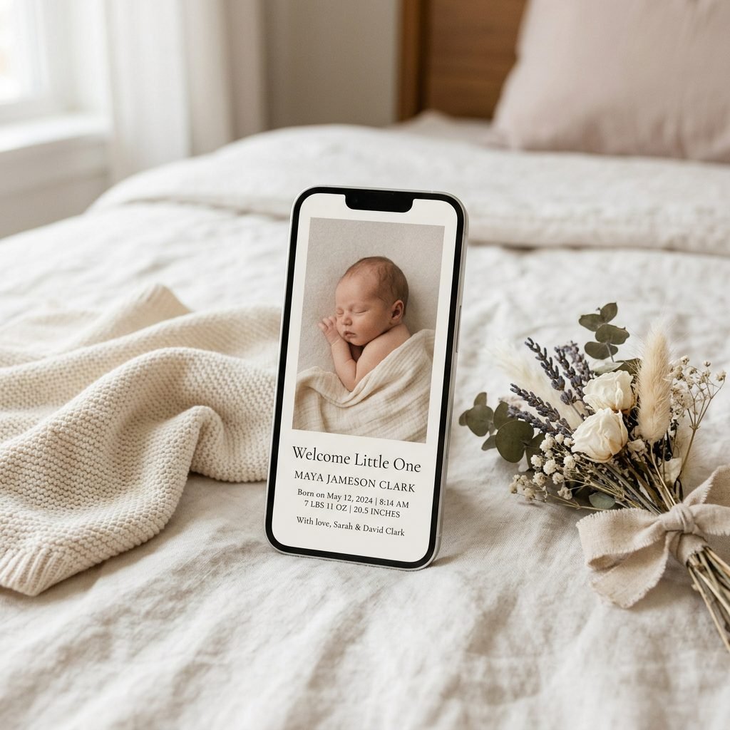
8 Editorial Style Digital Birth Announcement Card Ideas to Share Your Joy Elegantly
Welcome to the Golden Hour of Motherhood
Sweet mama, you’ve done it. You’ve crossed the threshold of birth and are now nestled in that sacred, hazy, beautiful bubble of the fourth trimester. As a doula, I know that these first few weeks are a whirlwind of oxytocin, late-night feedings, and the sheer awe of staring at those tiny fingernails. While the traditional paper route is lovely, many of my modern mamas are looking for something that feels more immediate, eco-conscious, and—let’s be honest—infinitely more stylish for the digital age.
Sharing your joy shouldn’t feel like another chore on your postpartum to-do list. That is why I am so passionate about the editorial-style digital announcement. This isn’t just a text message with a blurry photo; it is a curated, sophisticated piece of digital art that honors the magnitude of your baby’s arrival. We are talking about clean lines, high-end typography, and the kind of photography that looks like it belongs in the pages of a luxury lifestyle magazine. Whether you are sending these via a beautiful email campaign, a private messaging group, or sharing on your social feed, these ideas will help you announce your little one with grace and high-fashion flair.
In the rush of new parenthood, remember that your only job is to soak in the wonder. These announcements are a way to bottle that magic and share it with the world without ever leaving your nursing chair.
1. The ‘Vogue-Inspired’ Minimalist Masterpiece
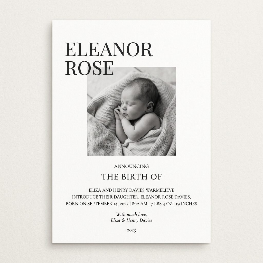
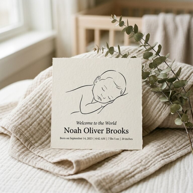
When we think of editorial style, we think of negative space. This design focuses on one high-quality image of your newborn, surrounded by plenty of ‘white space’ that allows the eye to rest. The typography should be serif-heavy, reminiscent of high-fashion mastheads. This look says that your baby is the ultimate cover star.
How to Style This Look
- The Photo: A clean, overhead shot of baby on a neutral linen sheet. No props, just baby in a simple white onesie or a soft swaddle.
- The Font: Use a classic serif like Didot or Bodoni for the baby’s name.
- The Palette: Stick to monochrome—blacks, whites, and soft greys.
The beauty of this style is its timelessness. It doesn’t scream ‘baby’ with pastels; it whispers ‘legacy’ with sophistication. It’s perfect for the mother who appreciates the ‘less is more’ philosophy in her home and wardrobe.
2. The ‘Film Grain’ Nostalgic Storyboard
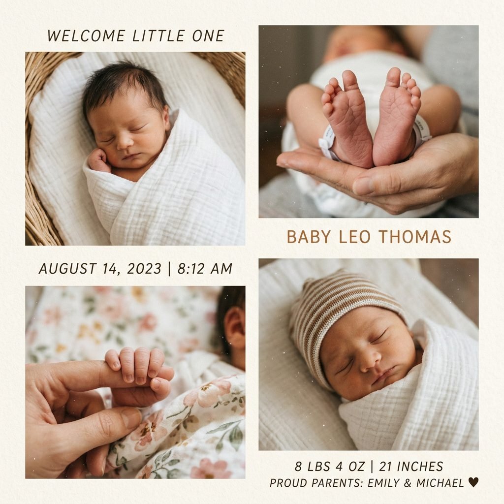
There is something deeply emotional about the look of 35mm film. It captures the raw, unfiltered reality of those first days home. An editorial storyboard uses a grid layout—typically three or four photos—to tell a narrative of the birth day or the first week home. This isn’t about perfection; it’s about feeling.
Elements of the Storyboard
- Candid Moments: A shot of tiny feet, a close-up of a yawn, and perhaps a shot of mama’s hand holding baby’s.
- The Edit: Add a subtle film grain filter and slightly warm tones to evoke nostalgia.
- The Layout: A vertical 2×2 grid works beautifully for mobile viewing.
This style is a favorite for doulas because it honors the process of birth and bonding. It shows that beauty exists in the quiet, unposed moments of the postpartum recovery period.
3. The ‘Typography-First’ Modernist Statement
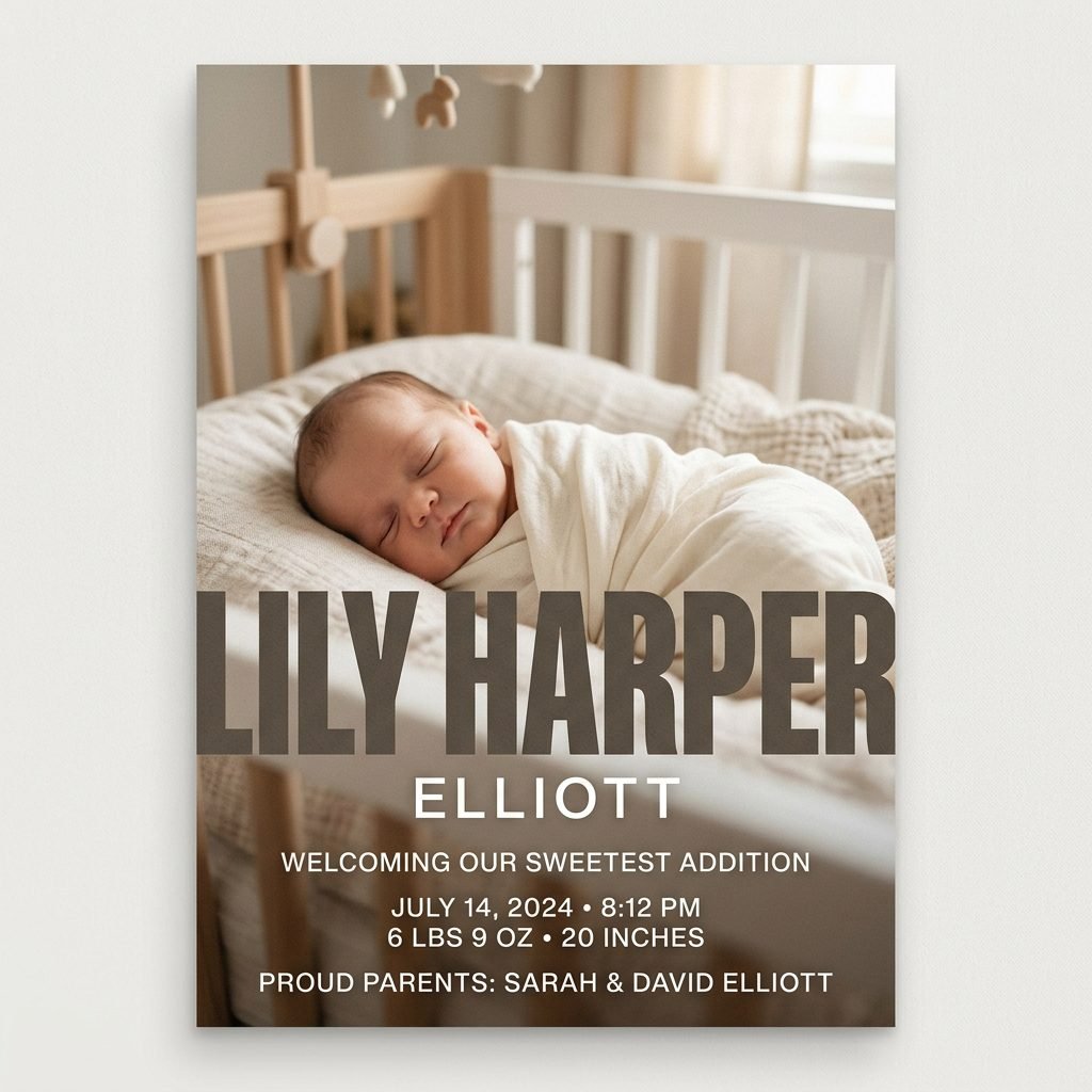
If you have a name you are particularly proud of, why not make it the focal point? This editorial style uses bold, oversized typography that overlaps a portion of the photo. It’s a graphic design-forward approach that feels very ‘New York Gallery.’ It’s bold, confident, and incredibly chic.
For this style, the photo acts more like a background texture. You might choose a photo with a lot of blur (bokeh) or a very simple composition so the text remains legible. Contrast is your best friend here. If the photo is dark, use crisp white lettering. If the photo is light, a deep charcoal or forest green text adds a grounded, premium feel.
| Design Element | Editorial Impact |
|---|---|
| Oversized Initials | Creates a brand-like, iconic feel for the baby. |
| Overlapping Text | Adds depth and a professional graphic design touch. |
| Sans-Serif Fonts | Gives a clean, architectural, and modern vibe. |
4. The ‘Naturalist’ Organic Texture Design
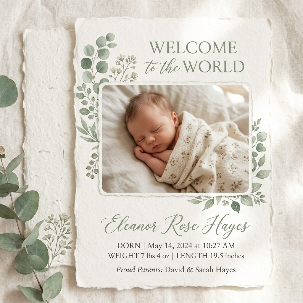
For the mama who loves earth tones, botanical sketches, and a ‘Kinfolk’ aesthetic, the Naturalist style is a dream. This editorial approach incorporates hand-drawn elements—like a single olive branch or a delicate wildflower—around the border of the digital card. It feels grounded, peaceful, and deeply connected to the miracle of life.
Creating the Organic Vibe
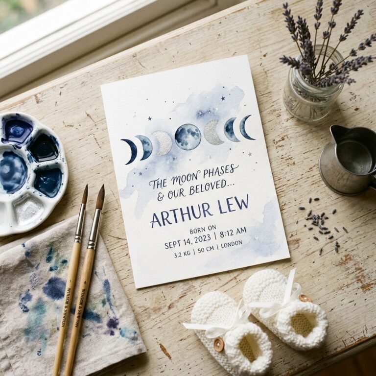
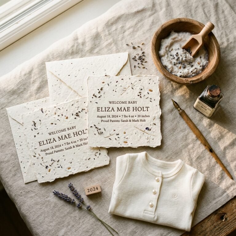
- Textures: Use a digital background that mimics the look of handmade deckle-edge paper.
- Colors: Think sage green, terracotta, oatmeal, and dusty rose.
- Photography: Natural light is non-negotiable. Place baby near a window during the ‘golden hour’ for that soft, ethereal glow.
This style is particularly soothing for the postpartum nervous system. It reflects a slow, intentional transition into motherhood that many doulas encourage during the first forty days.
5. The ‘Newspaper Special Edition’ Announcement
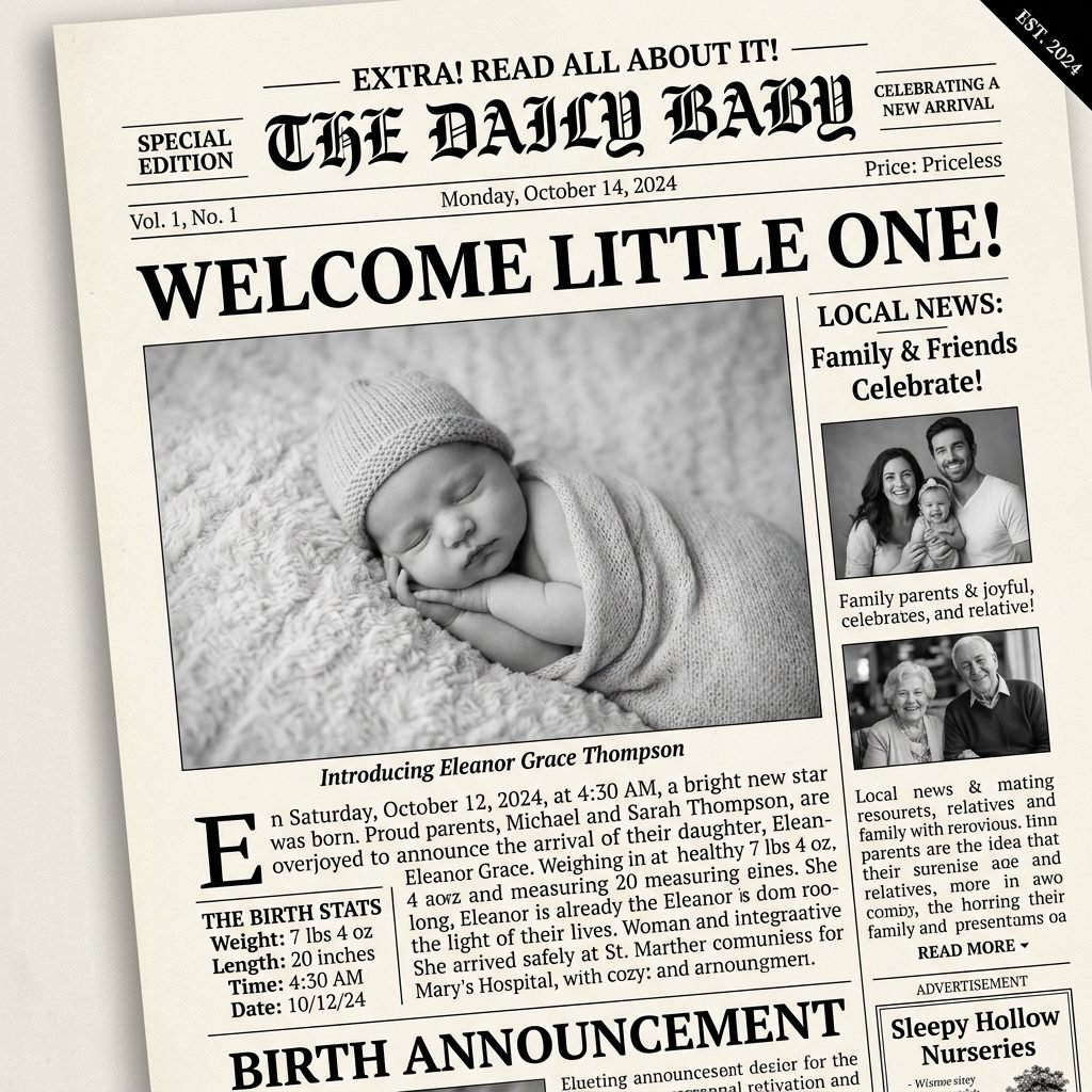
Want to lean into a bit of whimsical charm without losing the editorial edge? The ‘Special Edition’ newspaper layout is a brilliant way to share all those juicy birth details—weight, length, time, and location—in a structured, journalistic format. It’s a ‘Stop the Press’ moment for your family and friends.
Hear ye, hear ye! The world is a little brighter today. Our newest headline has arrived, and he is every bit as news-worthy as we imagined.
To keep this looking high-end rather than ‘crafty,’ use authentic newspaper fonts (like Times New Roman or Playfair Display) and keep the color palette strictly black and white. Use column-style layouts and small, elegant dividers to separate the statistics from the main photo.
6. The ‘Soft Monochromatic’ Studio Style

Consistency is the secret to a professional editorial look. In this style, the color of the baby’s swaddle, the background, and the digital card’s accent colors all fall within the same tonal family. For example, if you have a tan swaddle, you use a cream background and coffee-colored text.
Why Monochromatic Works
- Visual Harmony: It’s incredibly pleasing to the eye and feels curated.
- Focus: Without clashing colors, the focus remains entirely on the baby’s features.
- Sophistication: It mimics high-end interior design and fashion editorials.
This is a great option for mamas who might feel self-conscious about their home’s ‘clutter.’ By using a tight, monochromatic color palette, you create a controlled, beautiful environment in the digital space, even if your actual living room is currently a mountain of nursing pillows and burp cloths.
7. The ‘Lifestyle Documentary’ Candid
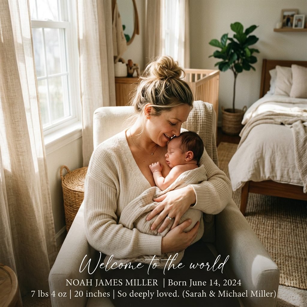
Editorial style doesn’t always mean perfectly posed. In fact, some of the most stunning magazine spreads are documentary-style. This announcement features a photo of the real life—mama and baby skin-to-skin, or a partner gazing down at the bassinet. It’s raw, it’s beautiful, and it’s deeply human.
To keep this ‘editorial,’ the key is the composition. Use the ‘rule of thirds’ to place your subjects, and ensure the lighting is soft. Avoid harsh overhead lights; instead, use the light from a nearby window. This style celebrates the doula-supported birth journey, showing the strength of the mother and the vulnerability of the newborn.
| Feature | Documentary Style | Studio Style |
|---|---|---|
| Posing | Unposed, natural movement | Carefully tucked and wrapped |
| Background | The nursery or home environment | Solid color or textured backdrop |
| Emotion | Intimate and raw | Serene and peaceful |
8. The ‘Abstract & Macro’ Detail Focus

Sometimes, the most powerful way to announce a new life is to show the smallness of it. An editorial ‘Macro’ announcement focuses on one specific detail: a tiny ear, a tuft of hair, or those iconic wrinkled newborn feet. It creates an air of mystery and artistic sophistication.
Macro Photography Tips for Moms
- Get Close: Use the ‘Portrait’ or ‘Macro’ mode on your smartphone camera.
- Focus on Texture: Look for the contrast between baby’s soft skin and a chunky knit blanket.
- Keep Text Minimal: Use a very small, elegant font at the bottom or side so as not to distract from the image.
This style is perfect for the mama who wants to maintain a bit of privacy by not sharing the baby’s full face on digital platforms while still sharing the profound beauty of their arrival.
Conclusion
Sharing Your Joy with Intention
Mama, as you prepare to hit ‘send’ on your digital announcement, take a deep breath and savor this moment. Whether you choose a bold typographic statement or a soft, monochromatic portrait, remember that this card is a celebration of your transition into this new chapter. These editorial styles allow you to share your baby’s arrival with a level of sophistication that matches the magnitude of the event. You don’t need a professional photographer or a high-end design degree to create something stunning—you just need a little bit of natural light, a touch of intentionality, and that beautiful baby of yours. Welcome to the world, little one, and congratulations to you, mama. You’ve created something truly editorial-worthy.